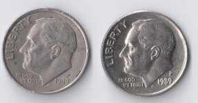
What's up with these two 1989 P dimes?
Why does the dime on the left look so dull compared to other dimes of it's year? The details and lettering look more defined and "flatter" as well. The dime on the right is what I find most dimes of that year look to like...but, it's not only in the picture for comparison! See the weird groupings of lines on the surface of that dime? What is that exactly? It appears on the back of the dime as well. They look like stretch-marks or something...but I doubt the it has been eating at McDonalds lately!
Why does the dime on the left look so dull compared to other dimes of it's year? The details and lettering look more defined and "flatter" as well. The dime on the right is what I find most dimes of that year look to like...but, it's not only in the picture for comparison! See the weird groupings of lines on the surface of that dime? What is that exactly? It appears on the back of the dime as well. They look like stretch-marks or something...but I doubt the it has been eating at McDonalds lately!