It’s very easy to come to completely the wrong conclusion about our date letters for hallmarking unless you understand the intricacies of the system. The web is full of information tables with the potential for misinterpretation.
The first thing to know is that we have had ten assaying cities over the years but they weren’t all established at the same time and aren’t all still in operation. So for example, the London assay office was founded in 1558 and started with an ‘A’ date letter in that year, whereas Chester wasn’t established until 1701 and began using a letter ‘A’ for that year (for London, 1701 would be an ‘F’ letter).
Also, it’s not the case that a particular letter comes round every 26 years. Not all the letters of the alphabet were used and missing letters vary from office to office as well as during particular periods. Chester for example used the letter ‘J’ in 1734 but it didn’t come round again until 1847 and then not again until 1909. All of that upsets the sequence for use of letters in a way that’s not uniform across all assay offices.
The way in which we distinguish what year a letter belongs to for a particular assay office is managed by a combination of the font style of the letter itself in combination with the shape of the cartouche it sits within and also to some extent the style and cartouche shape of the other compulsory marks. That needs to be the case since there aren’t a huge number of sufficiently distinct font styles to choose from (given that the letters are, of necessity, very small).
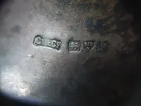
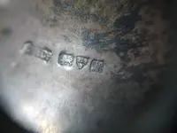
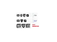
The hallmarks on this lamp have the city arms of Chester (a sword with three wheatsheaves) so that’s the assaying office. If we then look at the compulsory set of marks (ignoring the maker’s mark) for Chester in 1738 and 1913, this is what we have.

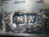
Note that the cursive ‘N’ is subtly different. For 1913, the terminations scroll back on themselves in a more exaggerated way. Then note that the style of the coat of arms is not the same for the two years, so that establishes a further point of difference. Then look at the cartouches for the lion passant guardant (the sterling mark) and the date letter. The bases for the 1913 cartouches are not flat, but are double-notched such that they have a point sticking out from them.
BUT… your hallmark doesn’t have those points does it? It’s not because the stamp was weak or because the points have worn away. It’s because there was a variation for a number of years in that cycle when some of the punches in use were produced with a flat based cartouche. Your marks have that stylistic variation. Whatever the reason for that variation, no-one was bothered about it because the hallmark set has other distinguishing features from that used in the 1700s.
One final thing to note is that there are four marks for the 1738 set but only three marks for the 1913 set. Another point of difference. The ‘extra’ mark is a crowned lion’s head facing. Without background knowledge, you might assume this is a mark for London, since those pesky reference sources on the net tell you that’s the case. Completely wrong. A hallmark won’t have two city marks. The lion’s head was an additional part of the fineness indication for early silver (dating back to 1300) which applied throughout the land. Although it still remained on the statute books as a requirement, it was generally regarded as obsolete and wasn’t rigidly enforced by all assay offices by the time we get to the 1700s. London applied it most rigorously (such that it became associated with the city itself), but it wasn’t until 1856 that a change in the law enabled it to be legally used for any purpose beyond indication of fineness and it then formally became the mark for London.

