How ugly nearly all modern coinage seems. All the state quarters, in addition to having that characteristic dull, clay-colored cast of all clad coins, look like play money, as does the new dollar. On it, Washington appears to have a terrible case of dyspepsia - he looks as if he's about to throw up. I agree with BScofield6 - I don't understand the appeal of any of these issues, and I predict they will have no value in the future. I confess I do like the lettered edge of the new dollar, however, as it's very retro. I am fortunate to have inherited an original St. Gaudens double eagle, with a lettered edge. How elegant, how exquisite the old coin designs were. The last finely wrought designs were, in my opinion, Weinman's winged liberty (mercury) dime and walking liberty half dollar, and McNeil's standing liberty quarter, although we know that it wore down too quickly to be practical. The obverse of Frasier's buffalo nickel is also wonderful, but the buffalo's head on the reverse looks too much like a bearded old man. It should have been modified. I also have some affection for the Jefferson nickel designed by Schlag, but only the original design makes the grade. The original lettering is different, and the depiction of Monticello on the reverse is brilliantly art deco, entirely different from what was ultimately approved. FDR objected to Schlag's original design, which was consequently changed, and not for the better. The July 2006 issue of Coins magazine has an article about the Jefferson nickel, with the ur-designs shown. You'll see what I mean.


")
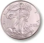
 Many of the US coins of the past were small, pocket sized, works of art...It's a shame some of the old designs aren't resurrected. The Silver Eagle was on the right track!