mts
Bronze Member
- #1
Thread Owner
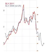
Ok... I was looking at the silver chart (SLV ETF) for 2008 and it looked eerily similar to what we are seeing now. So I took the chart of 2008, scaled it on the vertical axis by 2.25 to make the 2008 peak price more in line with the 2011 peak price, and superimposed the picture on the chart from the last four months. The result is a VERY scary similarity. Look at how the chart from the crash of 2008 (blue line) looks almost EXACTLY like what we are going through now (red line). The experts are calling for a crash of the market to come in the next few months. Follow the blue line on this chart to see where the red line would naturally follow. It shows silver at $20 in about two months. Note that I did not change the horizontal time axis at all. I couldn't have created a better match if I was trying to myself.
Take it or leave it. Me? This is a very bad sign. $20 silver could very well be coming. The recent run up to close to $50 is a very close match to the run up in 2007-2008 just before the big crash. What we are experiencing now looks exactly like the crash of 2008. In this case, it sure looks like 2+2=4. Feel free to look at the charts yourself. I think you'll see the same thing I did. Real? I don't know. Scary? Heck yeah!
Take it or leave it. Me? This is a very bad sign. $20 silver could very well be coming. The recent run up to close to $50 is a very close match to the run up in 2007-2008 just before the big crash. What we are experiencing now looks exactly like the crash of 2008. In this case, it sure looks like 2+2=4. Feel free to look at the charts yourself. I think you'll see the same thing I did. Real? I don't know. Scary? Heck yeah!


 Could it be done? Yes. This proves my point. Will it be done? No. Does this disprove my point? No, because I never said that the US currency wasn't going to eventually fail in the first place. But somehow you believe that I said that.