Michiganne
Silver Member
- Joined
- Mar 27, 2007
- Messages
- 4,402
- Reaction score
- 550
- Golden Thread
- 0
- Location
- SW Michigan
- Detector(s) used
- Explorer SE
- Primary Interest:
- All Treasure Hunting
- #1
Thread Owner
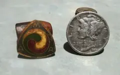
Yesterday Koleen and I hit our site for a few hours in the a.m. It is getting tough hunting with the weeds getting deep, the air humid, mosquitoes biting, poison ivy growing, and gnats flying into your eyes.  Koleen joked afterwards that maybe she's ready for a few tot lots. I found a worn '44 Merc under an oak tree and later a pin with "MAA" on it. Any idea on this one? It looks 60's to 70ish but I have no clue on "MAA." Mathematics Assoc. of America? Milk Assoc. of America? Mothers Are Awesome?
Our season may be winding down at the site but so far I've dug there 25 wheats, 2 Buff nickels, and 9 silver coins, including my first half. We're not finished there yet!
HH and thanks for looking,
Michiganne
Koleen joked afterwards that maybe she's ready for a few tot lots. I found a worn '44 Merc under an oak tree and later a pin with "MAA" on it. Any idea on this one? It looks 60's to 70ish but I have no clue on "MAA." Mathematics Assoc. of America? Milk Assoc. of America? Mothers Are Awesome? Our season may be winding down at the site but so far I've dug there 25 wheats, 2 Buff nickels, and 9 silver coins, including my first half.
HH and thanks for looking,
Michiganne


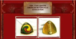

 It appears this new logo was introduced in 1971 so my pin is post '71. Thanks for the help, all you folks are great!


 Thank you!