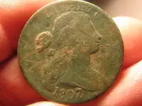
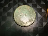
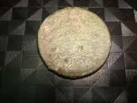
I have been up here in Virginia working, in my second career as an insurance adjuster. I was out hunting after I finished my last claim for the day. Sometimes to unwind, I try and get in a little hunting. I got permission to hunt an old house. I was really excite about hunting this area, as it was really old, and potential was good to great in my mind. After finding 3 recent coins, I got a signal that just sounded a bit bigger and had a different quality of sound on my ETRAC. I dug a plug with my shovel, and uncovered what I thought was a mid-`800's large cent. I couldn't make it out too well, but then, I saw the figure wasn't right. What is this, some foreign coin, I thought......then I turned it over and saw "ONE CENT" on the Reverse. What I turned it back over, and licked the front.....mmmmmmm Virginia dirt! LOL I still couldn't see what I wanted, so I walked back to my truck, and got my magnifying glass....OMG A Draped Bust!!!!
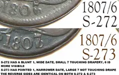
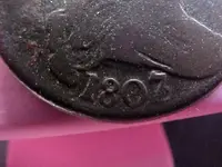
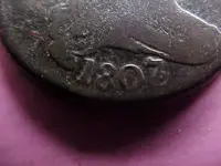
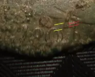
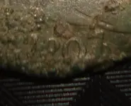
I looked lower for the date....the coin was minted 31 years after our country was founded.......an 1807 Draped Bust Cent!!!!!! Happy Dancing started in my mind as my body, if I ever started, might jiggle apart at my age!!!!!!! I was exstatic as you can imagine. I called my hunting buddy back home, Robert, to Brag....just a bit...we tease each other, but if truth be known, he is a better detectorist than I......Anyway, he called back later after he got my message and told me that one of them was really rare.....an 1807 over 6 stamp. I told him that was not what I had....darn the luck!
When I got back to my RV for the night, I went across to my neighbor, who is really interested in metal detecting, after having talked with me about our wonderful hobby. I told him to get a flashlight, that I wanted to show him why I metal detect. He brought one out, and shone the light on the coin. Time for surprise number 2........I am pretty certain I see the 6 beneath the 7 on the Obverse of the coin. He asked why I was so excited. I explained to him that the coin was a rarity. There is another, more rare, but this just topped the cake with icing for me.
She shattered my previous record on age, by some 40+ years. After all my hard work here in Virginia helping folks with their floods from Hurricane Irene, and just before I leave, the good Lord has blessed me with such a great part of our history.......that is her meaning to me. Most of our Founding Fathers were alive when she was made......it is an awesome save from the ground. I will remember the hunt for many years to come.....she may not be in the most pristine condition, but, OMG, how awesome that she has graced my collection....
HH
Dennis, who woke up with a beautiful lady this morning
I turned it back over, and licked the front.....mmmmmmm Virginia dirt! LOL I still couldn't see what I wanted, so I walked back to my truck, and got my magnifying glass....OMG A Draped Bust!!!!I looked lower for the date....the coin was minted 31 years after our country was founded.......an 1807 Draped Bust Cent!!!!!! Happy Dancing started in my mind as my body, if I ever started, might jiggle apart at my age!!!!!!! I was exstatic as you can imagine. I called my hunting buddy back home, Robert, to Brag....just a bit...we tease each other, but if truth be known, he is a better detectorist than I......Anyway, he called back later after he got my message and told me that one of them was really rare.....an 1807 over 6 stamp. I told him that was not what I had....darn the luck!
When I got back to my RV for the night, I went across to my neighbor, who is really interested in metal detecting, after having talked with me about our wonderful hobby. I told him to get a flashlight, that I wanted to show him why I metal detect. He brought one out, and shone the light on the coin. Time for surprise number 2........I am pretty certain I see the 6 beneath the 7 on the Obverse of the coin. He asked why I was so excited. I explained to him that the coin was a rarity. There is another, more rare, but this just topped the cake with icing for me.
She shattered my previous record on age, by some 40+ years. After all my hard work here in Virginia helping folks with their floods from Hurricane Irene, and just before I leave, the good Lord has blessed me with such a great part of our history.......that is her meaning to me. Most of our Founding Fathers were alive when she was made......it is an awesome save from the ground. I will remember the hunt for many years to come.....she may not be in the most pristine condition, but, OMG, how awesome that she has graced my collection....
HH
Dennis, who woke up with a beautiful lady this morning


Attachments
Upvote
0