What's new

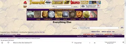
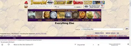
why are the words under the banner so big, is it......................

How would you rate our new look?

  • 1

    Votes: 0 0.0%
  • 2

    Votes: 0 0.0%
  • 3

    Votes: 0 0.0%
  • 4

    Votes: 0 0.0%
  • 5

    Votes: 0 0.0%
  • 6

    Votes: 0 0.0%
  • 7

    Votes: 0 0.0%
  • 8

    Votes: 0 0.0%
  • 9

    Votes: 0 0.0%
  • 10

    Votes: 0 0.0%

  • Total voters
    0
texastee2007 said:
if you have a personal page the old way is still there...I don't know if you have noticed. Thank you for the little mail box on the side. That makes it easier. Gave you a 10 for effort Marc.

Thanks, and yes, some PP template files need some work - thanks for noticing!
 
mrs.oroblanco said:
Marc,

I just cast the first vote. I gave it a 6 - just want to tell you why.

I'm one of those folks with "fat fingers" on the keyboard, and I use a laptop with no mouse. Under the headings, I'm having trouble clicking
on the item I want on the side list that comes up. (probably woulnd't have that problem if I had a mouse.) ;D

Other than that - it is definitely easier to read. And I like the inbox thing being separate - that was one of the things I was having trouble with.

Beth

Ok, in the coming days, I will give you a choice of styles. :headbang:
 
Marc,

It's really ok - I can get used to it. :coffee2:

I was just frustrated with my "fat fingers" :laughing7:

Beth
 
Oh, goodness, Texastee - I've lost count of the miles of fence.................................................................

:laughing9:


Beth
 
Hmmmmn, noticed LIVE is now missing ???
 
Not that the lettering is so BIG, it is that the banner is so SMALL.


;D

Everything seems to be shrinking shrinking, shrinking, shrinking ...
 
Marc said:
Don in SJ said:
Hmmmmn, noticed LIVE is now missing ???

use the clock icon

Marc, what clock icon? I can get "Live Posts!" by selecting from the menu next to your Avatar, but it does not always link to the posts, but I do not know where the "clock" icon is you refer to.

Don
 
Marc said:
Thanks!

(I think :icon_scratch:) LOL

I just added a poll to the top of this...

So please.... cast your vote!
i think you got it
 
Ray S ECenFL said:
Not that the lettering is so BIG, it is that the banner is so SMALL.


;D

Everything seems to be shrinking shrinking, shrinking, shrinking ...
sir that comes with age :laughing7:
 
Don in SJ said:
Marc said:
Don in SJ said:
Hmmmmn, noticed LIVE is now missing ???

use the clock icon

Marc, what clock icon? I can get "Live Posts!" by selecting from the menu next to your Avatar, but it does not always link to the posts, but I do not know where the "clock" icon is you refer to.

Don

huh.... you don't see this?
 

Attachments

  • clock.webp
    clock.webp
    33.3 KB · Views: 180
i dont know about old, im just well schooled
 
I like the new look, well done marc :icon_thumleft:, the only bit I can't work out yet is how to see who is in chat before going in the room. I hate an ambush
38fc19c7e4ceedffa23a3415d172aa03.gif
. All in all, the color and style get a BIG thumbs up
Alien_Thumbs_Up_Grinning.gif
 
Marc said:
Don in SJ said:
Marc said:
Don in SJ said:
Hmmmmn, noticed LIVE is now missing ???

use the clock icon

Marc, what clock icon? I can get "Live Posts!" by selecting from the menu next to your Avatar, but it does not always link to the posts, but I do not know where the "clock" icon is you refer to.

Don

huh.... you don't see this?

Nope, no clock icon on my screen....Never has been since the update.
 

Attachments

  • no clock icon.webp
    no clock icon.webp
    67.2 KB · Views: 167
  • no clock icon.webp
    no clock icon.webp
    67.2 KB · Views: 166
None on mine either Marc.
 
i have the clock. small on right side. for real time posting. like the old live posts
 

Users who are viewing this thread

Latest Discussions

Back
Top Bottom